Graphic Design / 02
Branding
Logo systems shown through real applications.
Brand identity work organized around concept, logo clarity and how each mark performs across realistic applications.

Brand identity work organized around concept, logo clarity and how each mark performs across realistic applications.
This collection focuses on concept, logo clarity and real-world application. Each identity is shown through practical contexts such as signage, apparel, product surfaces and brand materials.
The strongest logo work is not only a standalone mark. It needs to work across backgrounds, sizes, signage, uniforms and client-facing materials.
Each identity starts with a visual idea connected to the business, audience or brand personality.
Mockups help test how the mark behaves in real spaces, not only on a white canvas.
The logos use simple shapes, readable type and memorable cues so they stay recognizable.
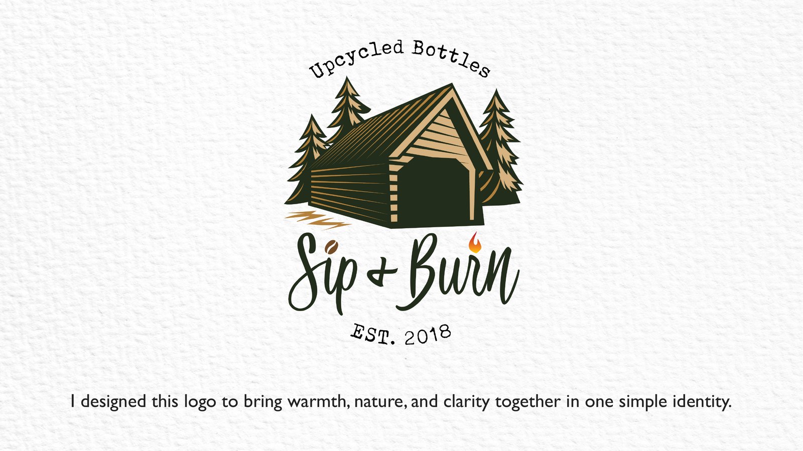
A cozy outdoor identity built around warmth, nature and gathering. The design combines a cabin, trees, script typography and small detail cues like a coffee bean, plus sign and flame.
The identity was designed for a brand connected to upcycled bottles, drinks and outdoor gathering. The goal was to keep multiple elements balanced without making the logo feel crowded.
The main design decisions are summarized for quick review, from concept and challenges to visual approach.
The logo captures people coming together, enjoying a drink and sitting around a fire in a natural setting.
The cabin represents shelter, trees reinforce nature, and script typography adds personality while staying readable.
Deep green and warm beige tones support the natural outdoor mood and keep the identity print-friendly.
Logo applications are presented with consistent image cards so each identity can be reviewed clearly.
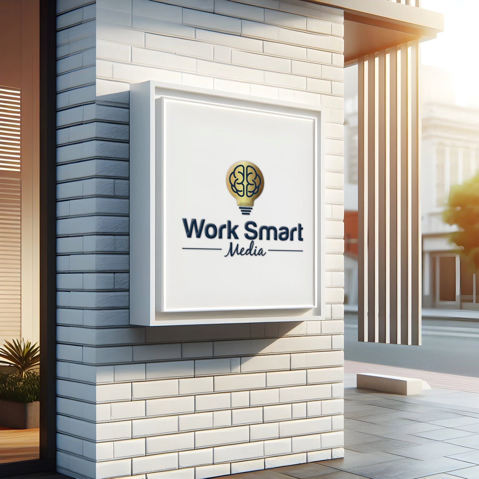
Professional logo application shown on exterior signage.
Clean medical identity application with a soft gradient mark.
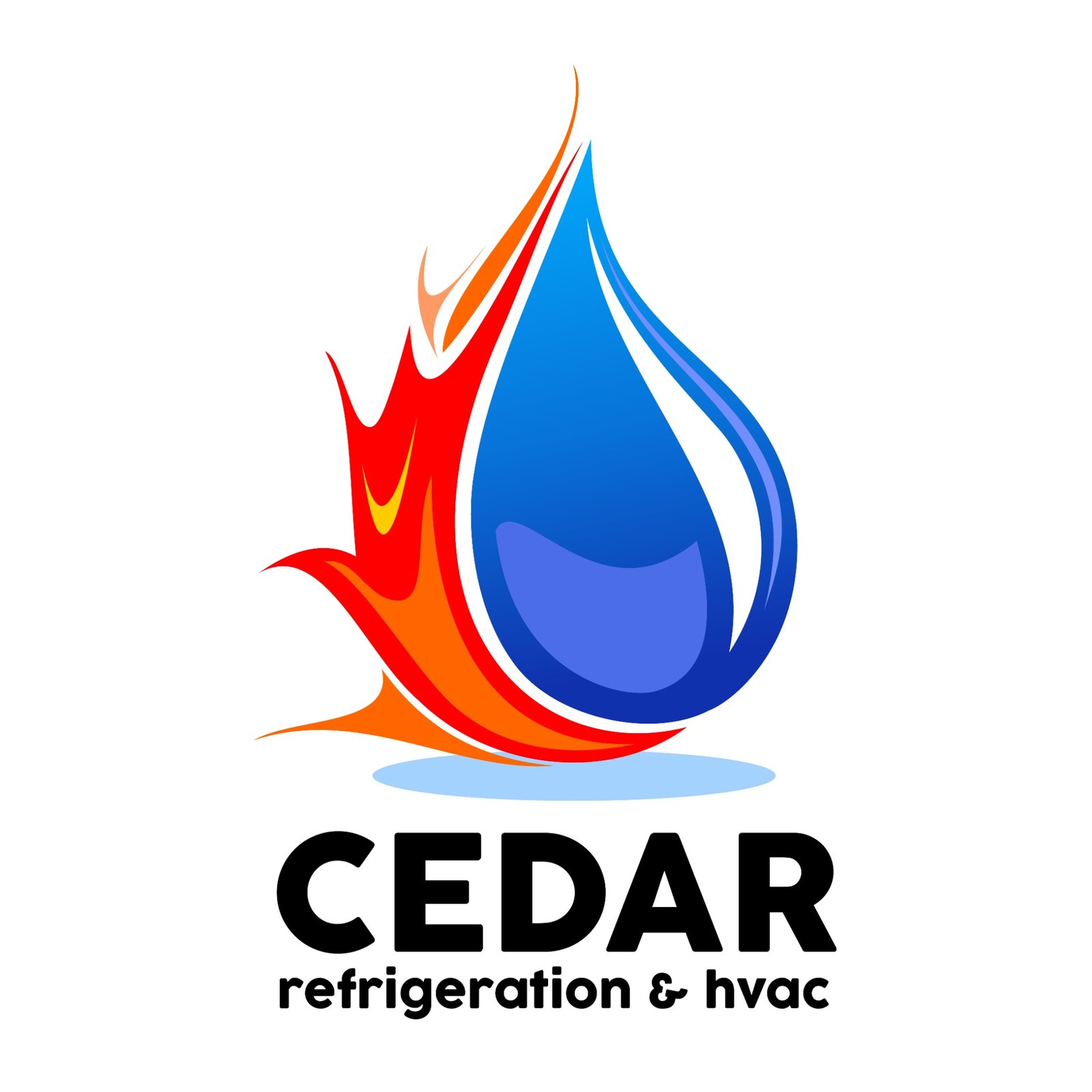
Service logo combining fire and water cues for HVAC and refrigeration.
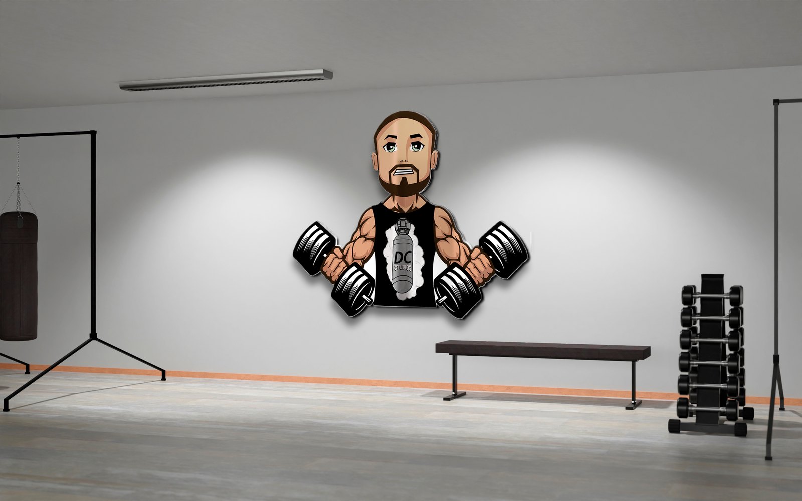
Illustrated gym mascot graphic applied to an interior wall setting.
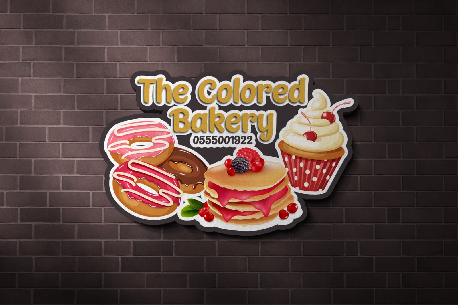
Playful bakery signage with illustrated sweets and dimensional mockup styling.
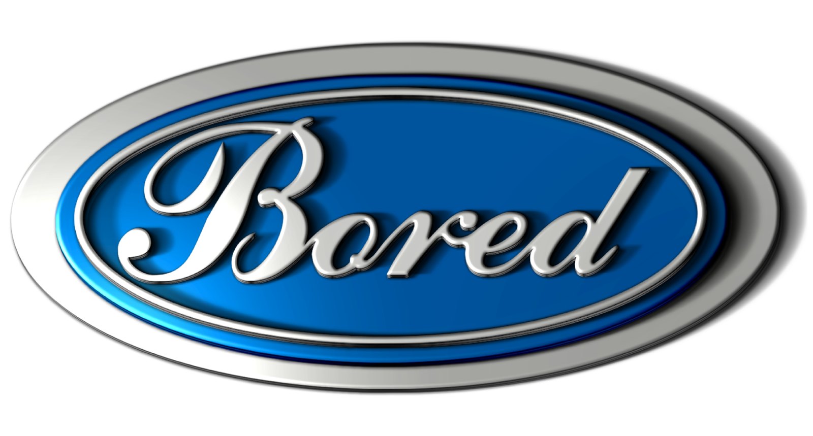
Script-driven logo exploration with a polished dimensional style.
Review additional projects across packaging, identity and marketing collateral.
Available for packaging, brand identity, marketing collateral, editorial layouts, UI/UX and frontend design projects.